
This is the first in a series of posts discussing the three basic genres of type styles: serif, sans-serif and script. There are tons of variations within these styles, but learning these basics will establish a good foundation in your lettering repertoire.
Read More
What is Typography? (Part 2)
Last week, I defined typography. A while ago, I covered the basic typographic guidelines in my post on alignment. Here, I'll dive into type anatomy. Each character (defined as any number, letter or punctuation mark in a typeface) is made up of various pieces. Just like you have hands and feet, characters have specific body parts.
Read More
What is Typography? (Part 1)
You say toe-may-toe, I say toe-mah-toe. You say GIF (hard g), I say JIF (soft g). (For the record, it's pronounced "JIF.") The world of type is full of terms that are constantly misused. Don't get me wrong, I still struggle with choosing the right terminology too. So I wanted to define some of the most common terms, for your benefit and mine.
Read More
SketchBox Review
Ever heard of Birchbox? BarkBox? BroBox? Monthly box subscription services are a popular way to have samples of products delivered right to your door. One of those services is SketchBox, which offers a variety of art supplies.
Read More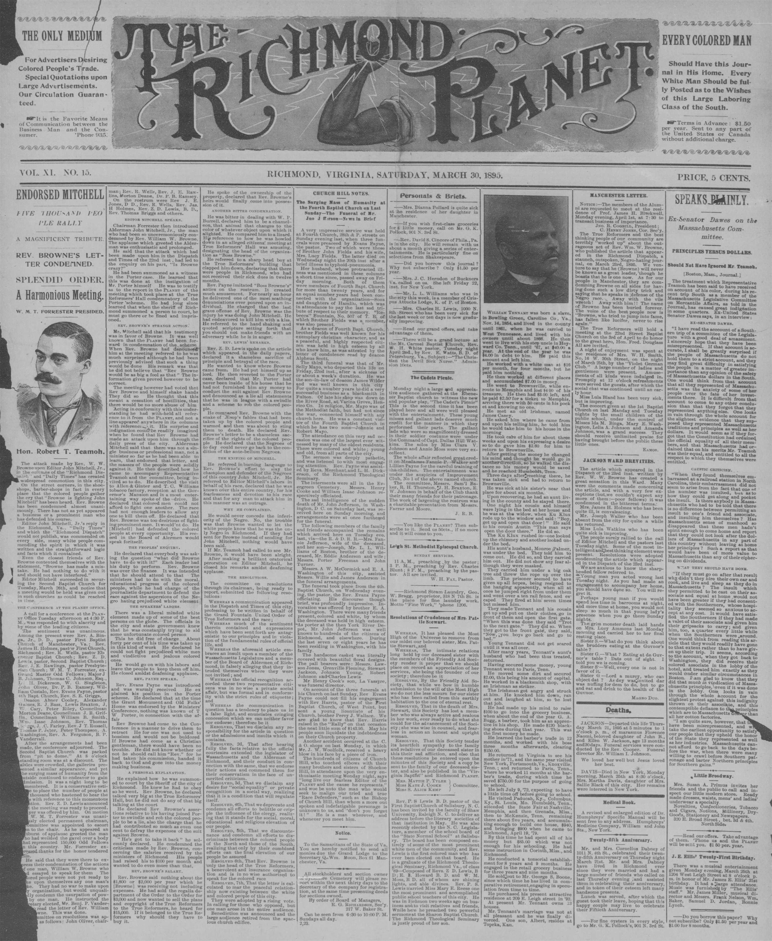
The first elaborate masthead I found that inspired me to look for more.
Vintage Newspaper Mastheads
As I mentioned in my ghost signs post, I always had a hard time in history classes because the big picture ideas were so boring to me. But whittle things down to small, relatable details and you've got my attention.
Read More