As I mentioned in my ghost signs post, I always had a hard time in history classes because the big picture ideas were so boring to me. But whittle things down to small, relatable details and you've got my attention.
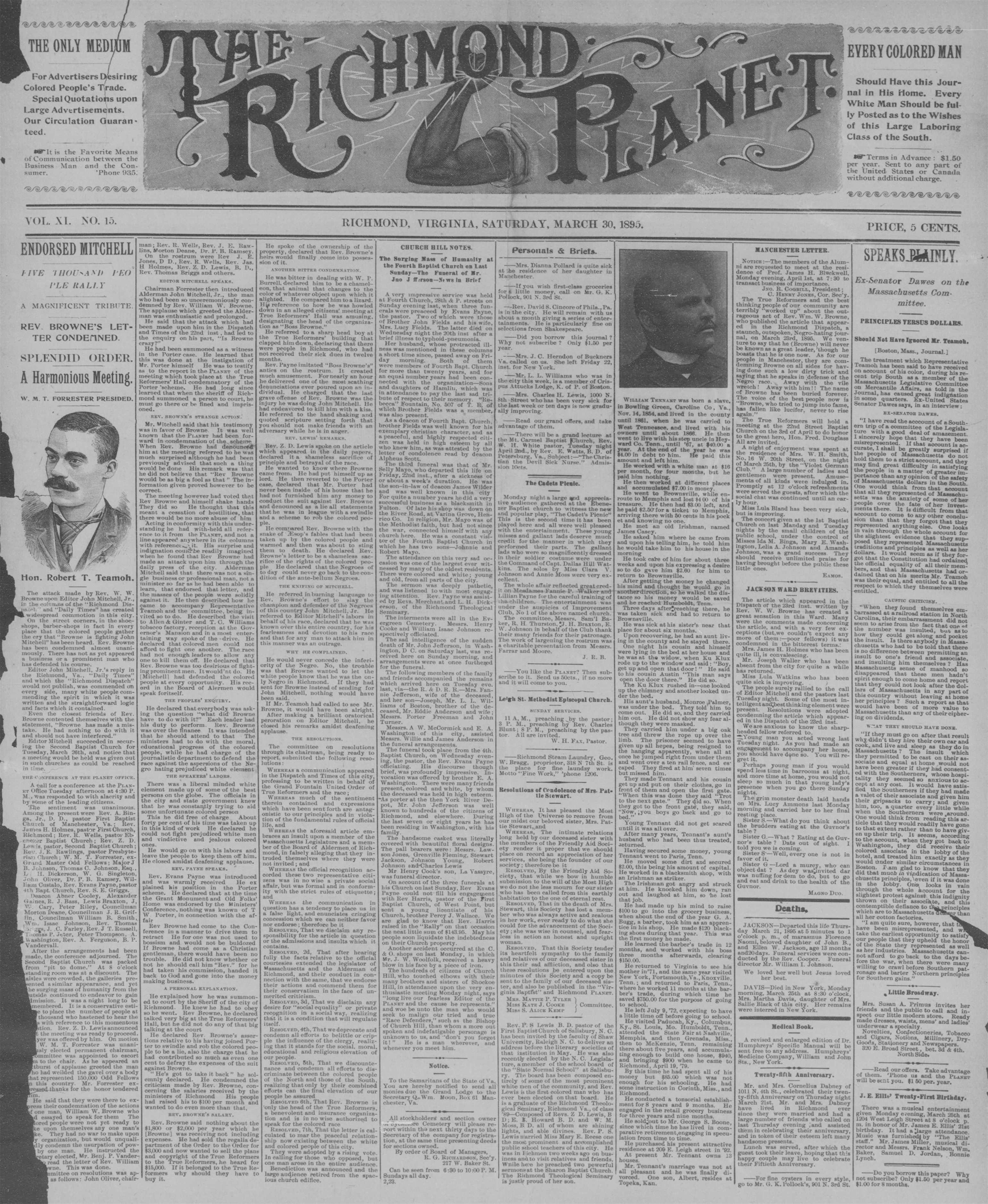
I was researching something for my day job in the Virginia Chronicle, a massive collection of digitized newspapers in Virginia (some dating all the way back to 1787). I stumbled across The Richmond Planet (above) — a newspaper founded by 13 former slaves, "a staunch defender of the African-American community and a voice against racial injustice."
I love the details in this masthead (That TH ligature! Those flourishes on the Ts!). The incorporation of the illustration is fantastic as well. See how the fist lines up with the O, and how the lightning bolt lines radiate from it? Gorgeous. It makes the whole thing a symmetrical composition even with the asymmetrical lettering.
I searched through the Richmond area newspapers in the collection for more intricate mastheads and found some great hidden gems for lettering inspiration.
Some of my favorites are below. Click each image to enlarge. (All photos in this post via the Virginia Chronicle.)

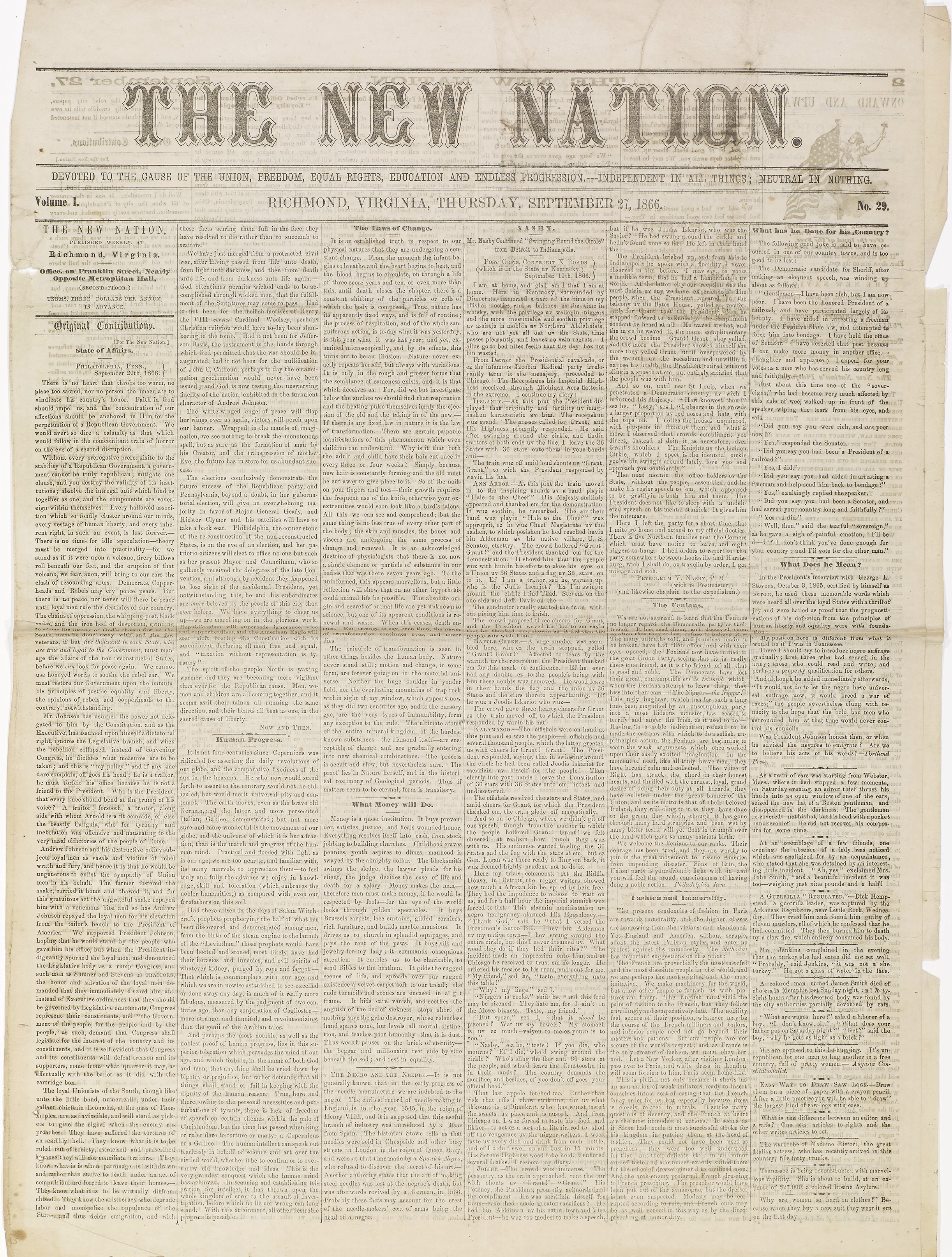
Interesting dashed line detail in the letters plus another use of illustration in the masthead.
Beautiful bifurcated serifs

A weekly publication with charming illustrations distributed at “Sabbath Schools” who subscribed to it.
A precursor to Richmond’s current newspaper, this masthead includes illustrations of the Washington and Lee monuments which are still standing on Monument Avenue.

Simple (like many other mastheads of the time) but with a quirky R.

The tiny swirls make this a pretty fun blackletter style.
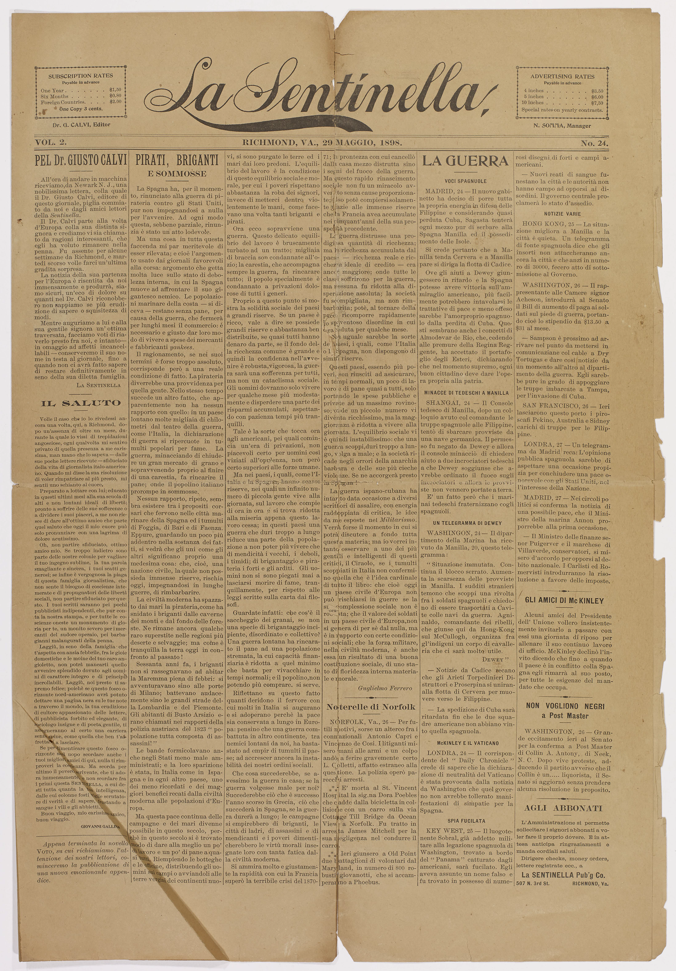
Pretty script; I wouldn’t expect anything less from an 1898 Italian newspaper. (An Italian newspaper in Richmond?! I would love to know more about the history of this!)
Browsing through The Virginia Chronicle is like going down a glorious lettering rabbit hole. I only focused on Richmond area newspapers, but I'm sure there are plenty more beautiful mastheads to be discovered. While you're there, be sure to check out the comics and advertisements too!