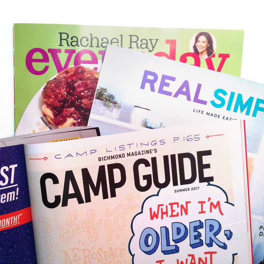
I am in a unique situation where I have the perspective of a freelancer and an editorial art director. I know what freelancers are thinking when marketing themselves, and I know what makes an impression on art directors. Here's how to pitch yourself to publications...from an art director who works at one.
Read MoreIn the Thick (and Thin) of It
One of the most common mistakes in lettering is found within most styles of contrasted type: where people use thick and thin strokes. It's a dead giveaway showing that you don't truly understand typography. If the stroke weight isn't in the right places, your lettering will feel unbalanced. The main culprit (and my biggest pet peeve) is the capital A.
Read MoreDon't Be Afraid to Make Mistakes
I keep trying to grow my freelance business but I always hit a snag. In order to do one thing, I have to do ten other things first...just like the storyline from one of my favorite childhood books, "If You Give a Mouse a Cookie." For example, Instagram has this cool business feature that can give you insight into your followers and post performance. But it requires a Facebook business page, which I don't have at the moment.
Read MoreBack to Basics: Script
This is the third and final installment of my series discussing three fundamental type styles. (Check out the other two posts on serif and sans-serif type.) Mastering these three basic styles will enable you to letter almost anything!
Read MoreBack to Basics: Sans-Serif
This is the second post in my "Back to Basics" series discussing the three basic categories of type styles: serif, sans-serif and script. Knowing these three styles will allow you to letter almost anything you can imagine. Last week, I talked about serif type. This week, we're stripping it down to sans-serif.
Read More


