
I've been writing weekly blog posts for almost a year now (go me!). I've covered everything from lettering inspiration to freelance tips, with some great interviews thrown in as well. If you're interested in learning hand lettering, check out this roundup of the most important things you need to know.
Find Your Style
The ongoing quest for everyone...including me!

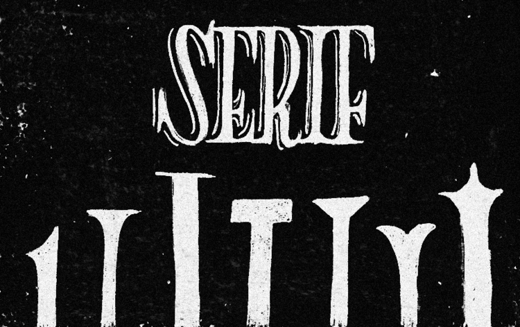
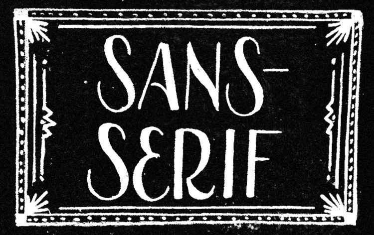
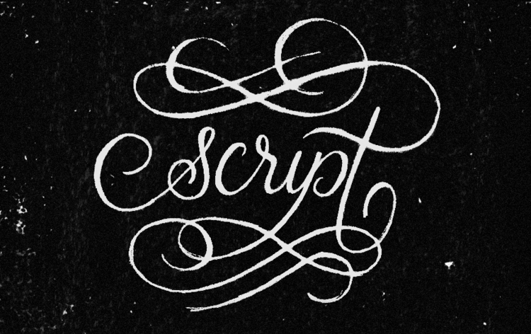
Three Basic Genres of Type
Once you know the three basic styles — serif, sans-serif, and script — you can letter anything.
Lettering vs. Calligraphy
These two art forms are commonly mistaken as being the same thing...know the difference!

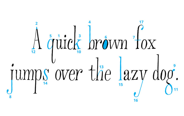
What is Typography?
There are several type terms that you need to be familiar with, not to mention type anatomy too.
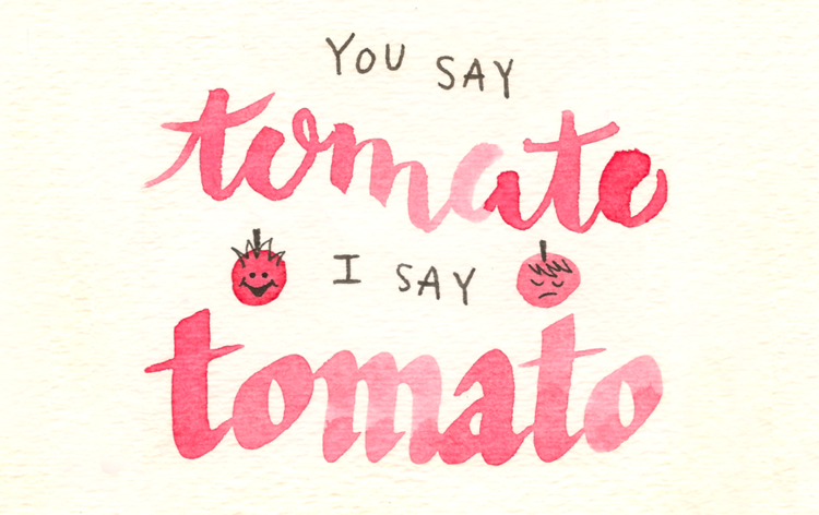
Thicks and Thins
One of the golden rules in script and contrasted lettering: use thick downstrokes and thin upstrokes.

Overshoot
This is a small but important concept that help your lettering look more balanced.
