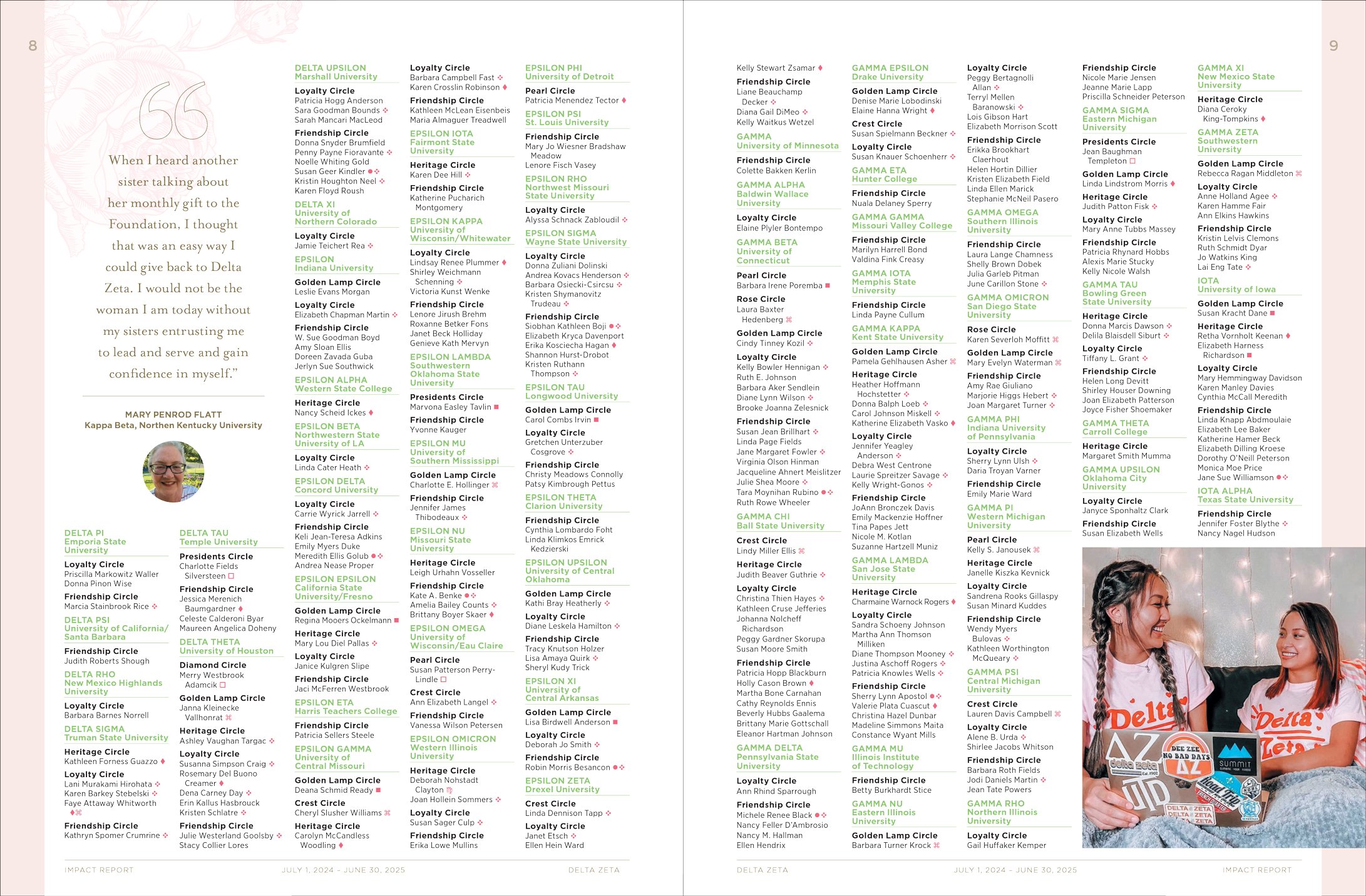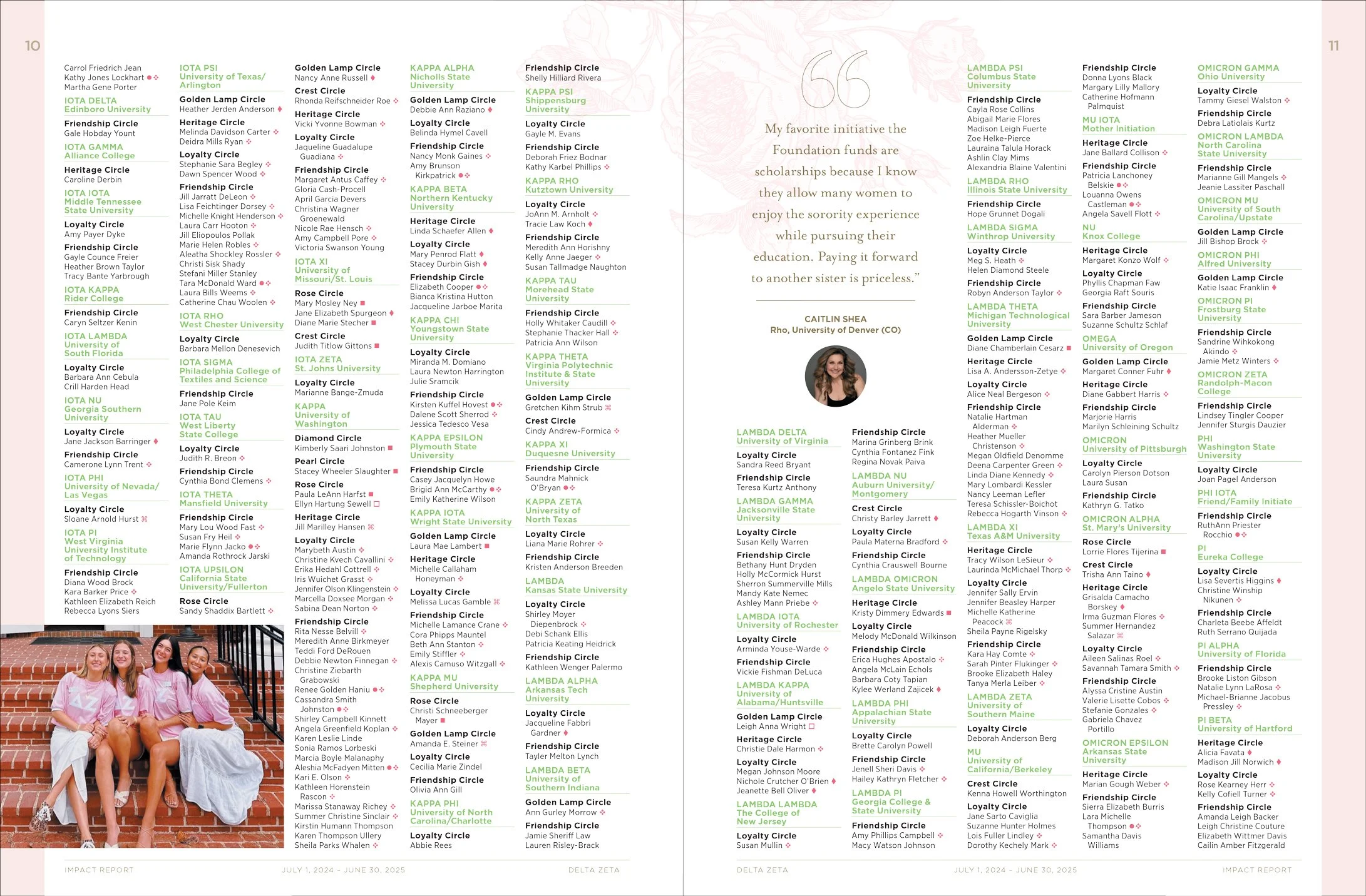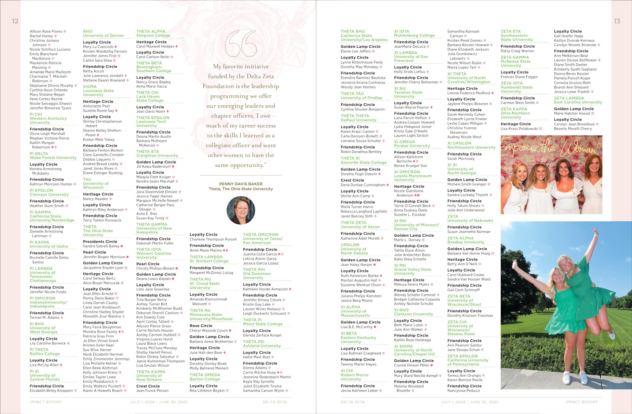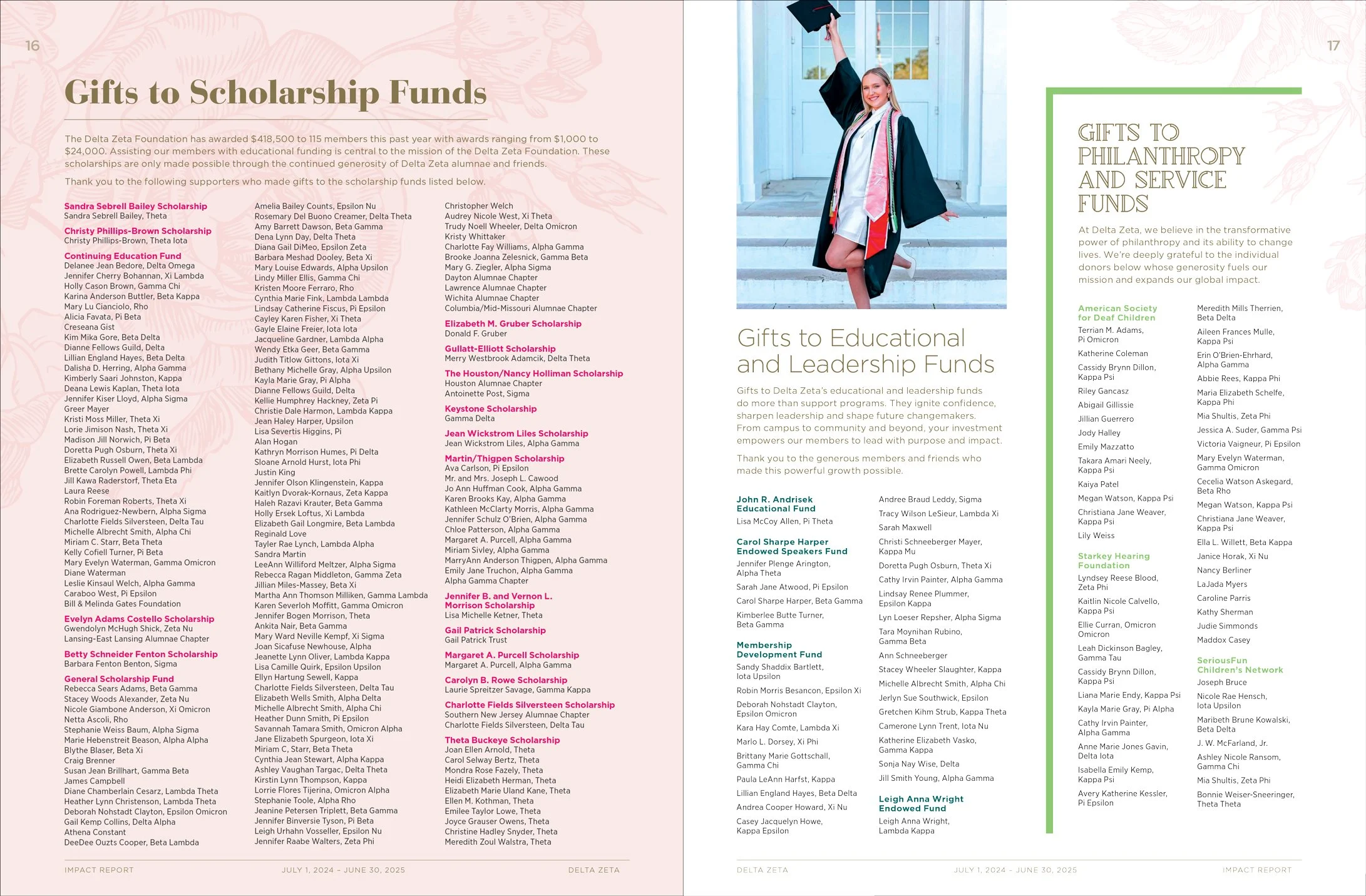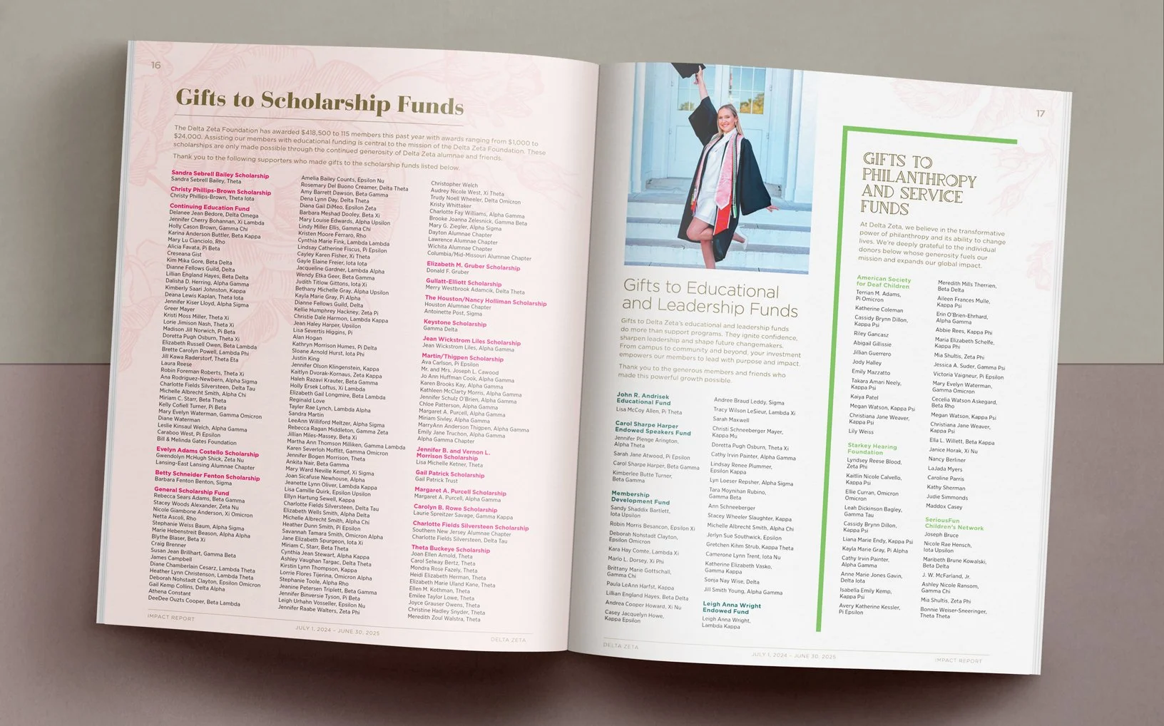
In my third year working on the annual Impact Report for The Delta Zeta Foundation, I changed things up a bit.
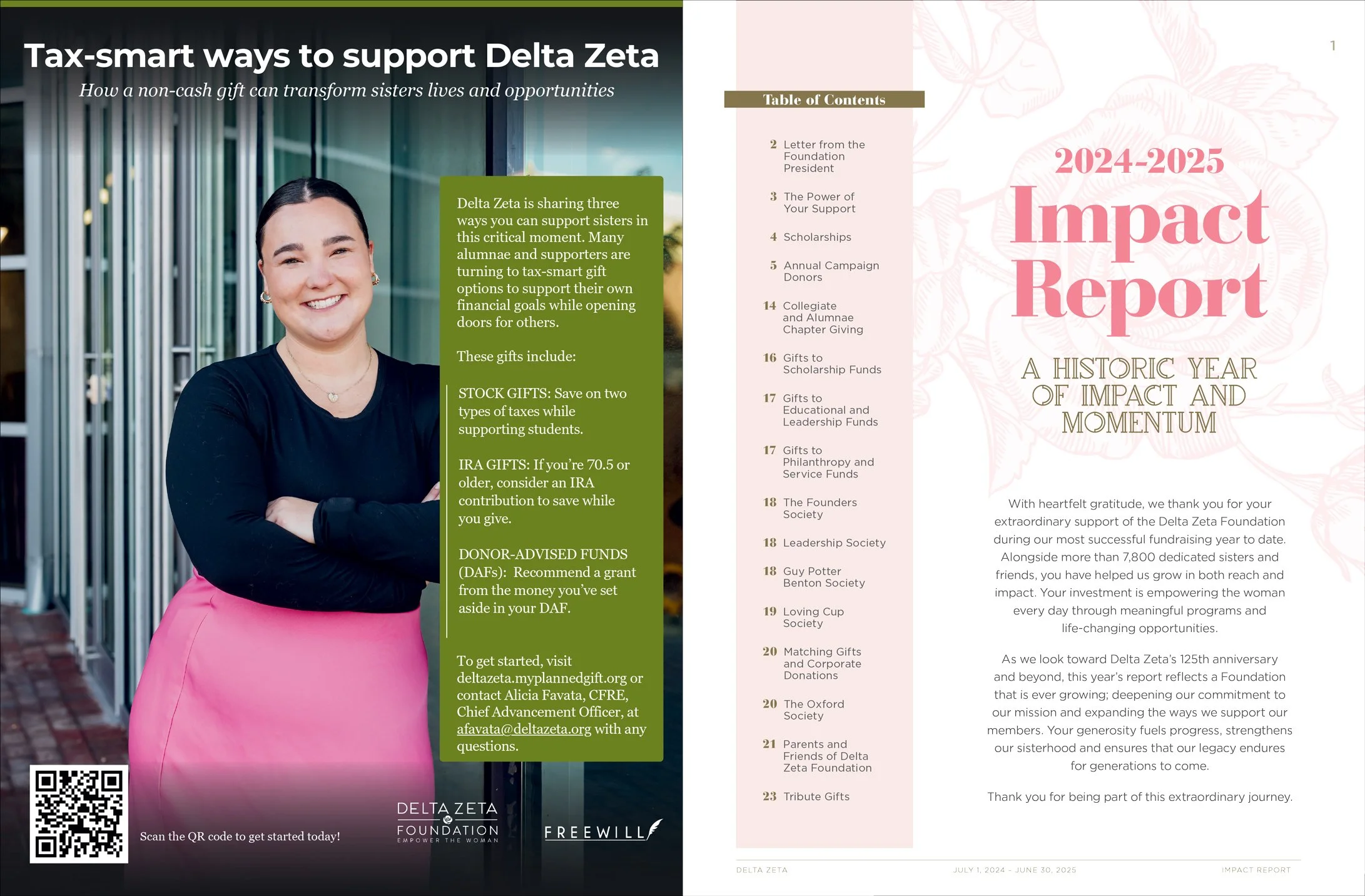
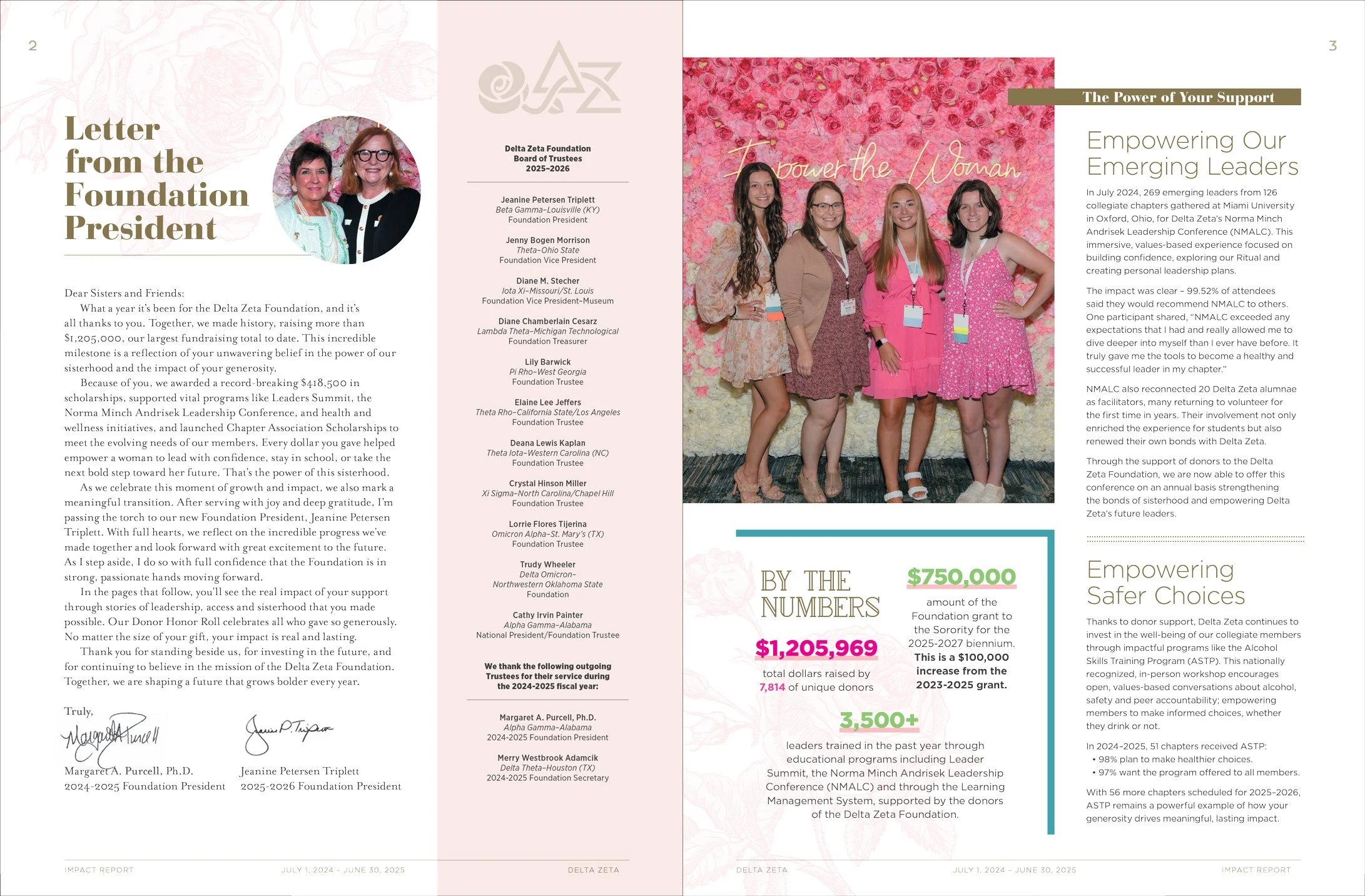
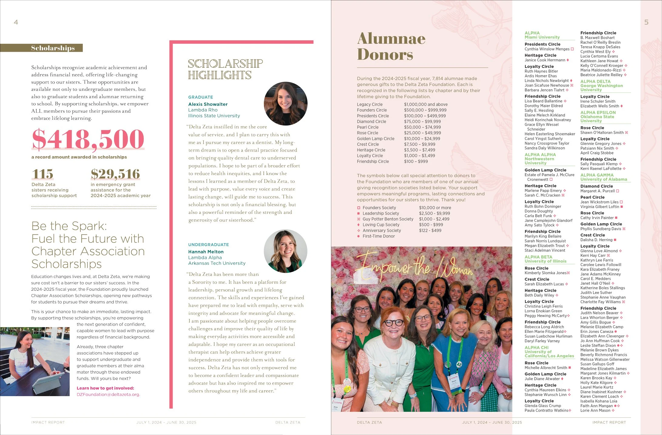
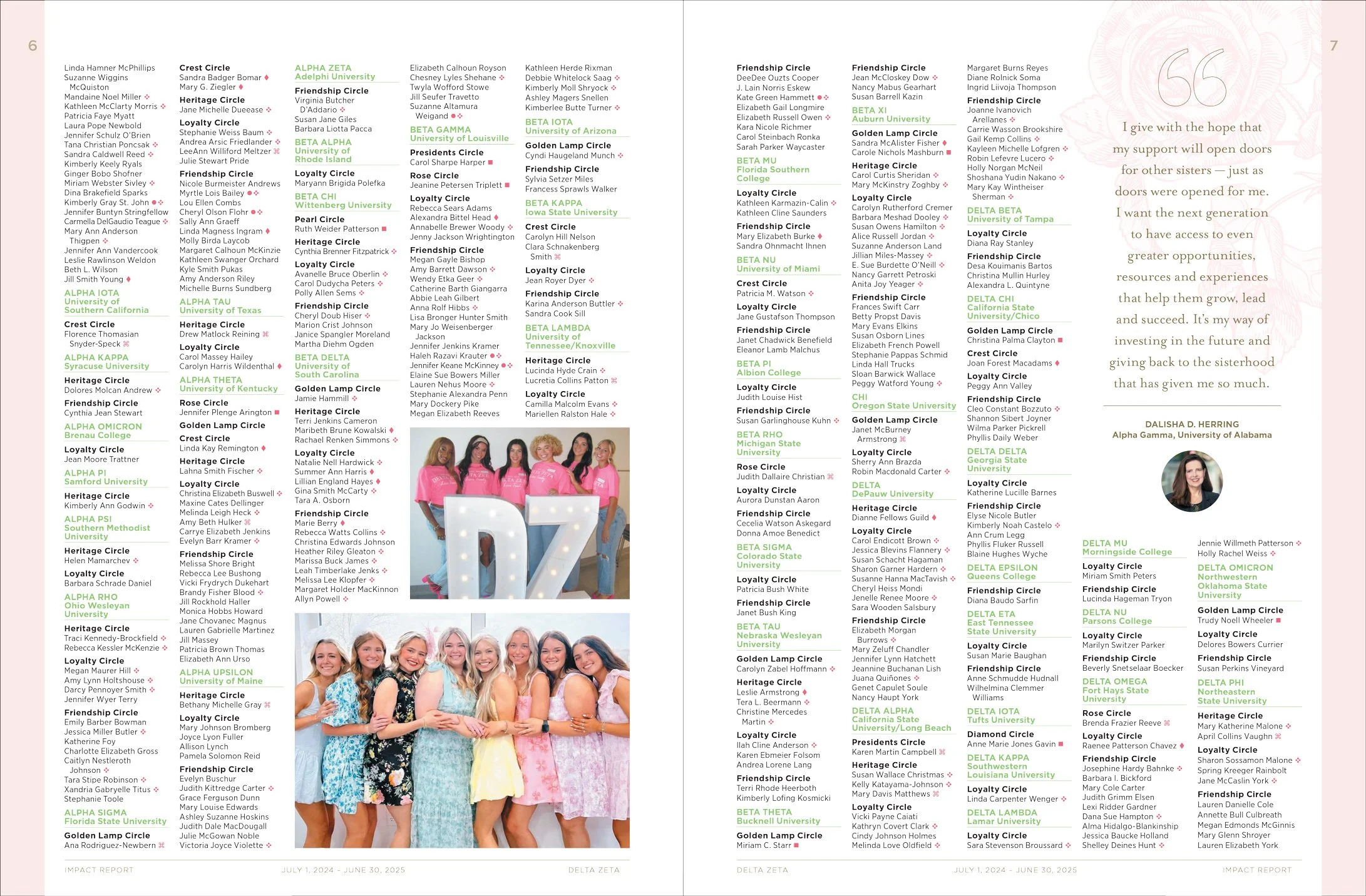
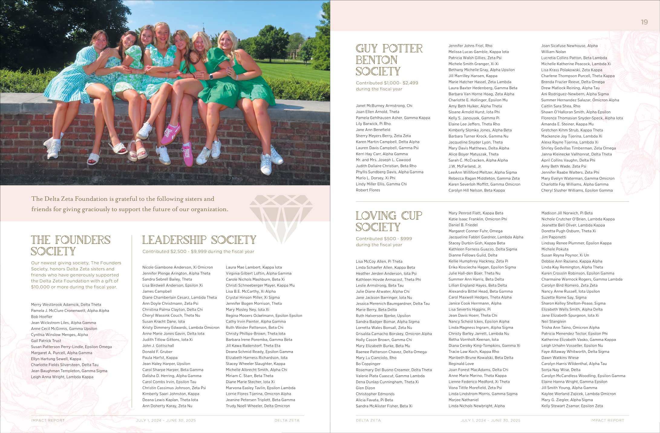
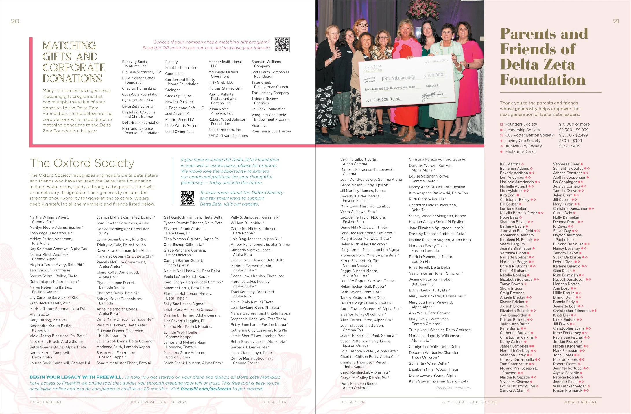
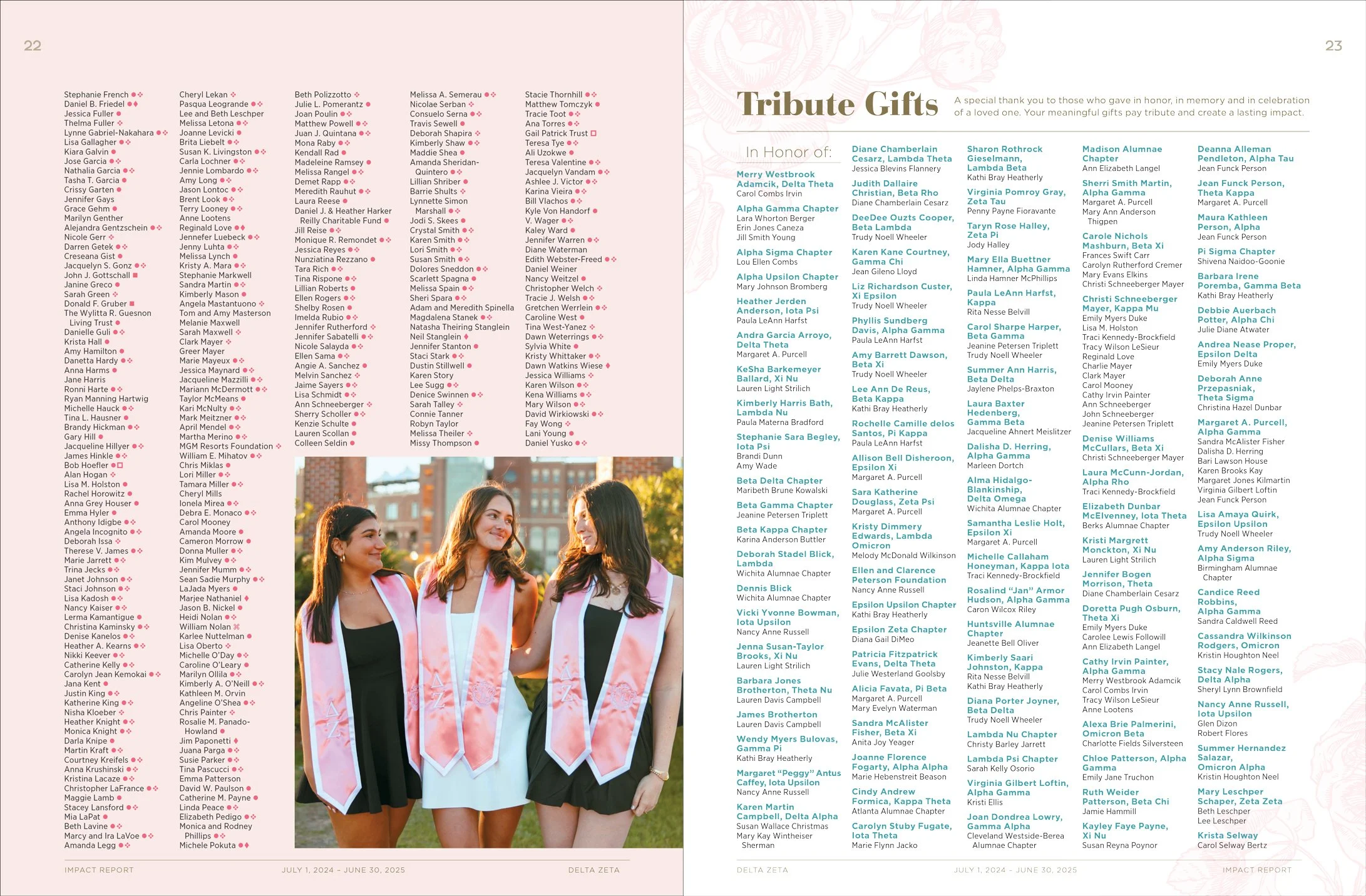
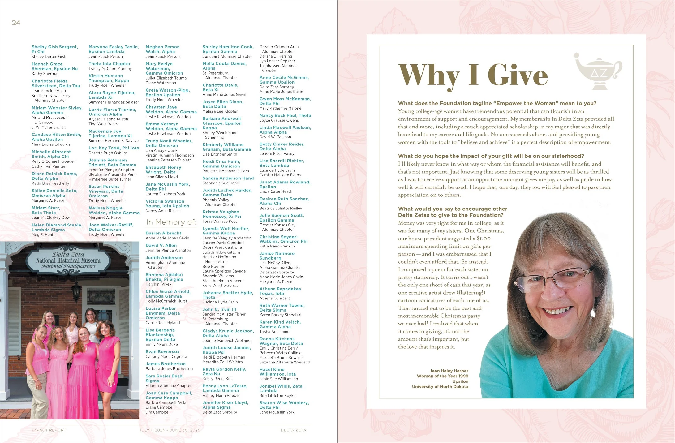
Previous designs relied on the bold colors of the brand and had a heavier look. This time I focused on the lighter side: the light pink rose motif in the background, thin lines and typefaces, and as much white space as possible. I was especially pleased with the cover approval — the faded white I added at the top was a bold choice(!) and out of the norm for them. I think it set the tone for the rest of the piece beautifully.
Contracted by Tria Designs.